Dark Khaki Color (#BDB76B)
Dark Khaki is a CSS named color defined as hex code #BDB76B. Dark Khaki is a muted olive-yellow with low saturation, closer to the color of khaki fabric than CSS khaki.
Color Overview & Formats
darkkhakiLuminance: 0.4575| Format | Syntax / Values | Notes | Action |
|---|---|---|---|
| HEX | #BDB76B | 6-digit hex web code | |
| RGB | rgb(189, 183, 107) | Red, Green, Blue channels (0-255) | |
| HSL | hsl(56, 38%, 58%) | Hue (56°), Saturation (38%), Lightness (58%) | |
| HSV / HSB | hsv(56, 43%, 74%) | Hue, Saturation (43%), Value/Brightness (74%) | |
| CMYK | cmyk(0%, 3%, 43%, 26%) | Digital mathematical approximation (non-print) | |
| OKLCH | oklch(0.767 0.098 104.5) | Perceptually uniform color space (CSS Color 4 approximation) |
background-color: #BDB76B; /* or darkkhaki */- Select color format: Choose the desired format (HEX #BDB76B, RGB, or HSL).
- Copy the code: Click the copy button or press Tab+Enter to store in clipboard.
- Pair with black text: Black text on Dark Khaki reaches 10.15:1 (WCAG AAA).
What Colors Go With Dark Khaki?
These 6 colors all go well with Dark Khaki (#BDB76B), and each one is a standard CSS named color. The ratio is the WCAG 2.2 contrast of that color on Dark Khaki: at 4.5:1 or above it works for text; below that, use it for backgrounds and accents.
Harmonious Palettes & Tints
The palettes below are algorithmically generated across standard intervals based on Dark Khaki (HSL 56°). Each group offers full palette copy and live preview:
Complementary Harmony
Hue rotated 180 degrees on the HSL wheel (56° to 236°), keeping the original saturation and lightness.
Analogous Harmony
Hues 30 degrees either side (26° and 86°), keeping the original saturation and lightness.
Triadic Harmony
Hues spaced evenly by 120 degrees (176° and 296°), keeping the original saturation and lightness.
Tints & Shades
Mixed with white (tints) and black (shades) in sRGB at 60% and 30%.
WCAG 2.2 Text Readability & Contrast Check
Under WCAG 2.2 criteria, regular body text requires at least 4.5:1 (AA) and large text requires at least 3.0:1. The table below displays calculated contrast ratios:
| Foreground Color | Contrast Ratio | Normal Text (AA) | Large Text (AA) | Normal Text AAA (>= 7.0:1) |
|---|---|---|---|---|
Pure Black (#000000) | 10.15:1 | Pass | Pass | Pass |
Pure White (#FFFFFF) | 2.07:1 | Fail | Fail | Fail |
Dark Charcoal (#212529) | 7.46:1 | Pass | Pass | Pass |
Mid Gray (#666666) | 2.78:1 | Fail | Fail | Fail |
Interactive Contrast Tester
Enter text foreground and background colors to verify WCAG legibility:
This is sample body text rendered directly to verify contrast and readability.
Dark Khaki Background Download
Download standard 1920x1080 solid desktop wallpaper or generate mobile wallpaper:
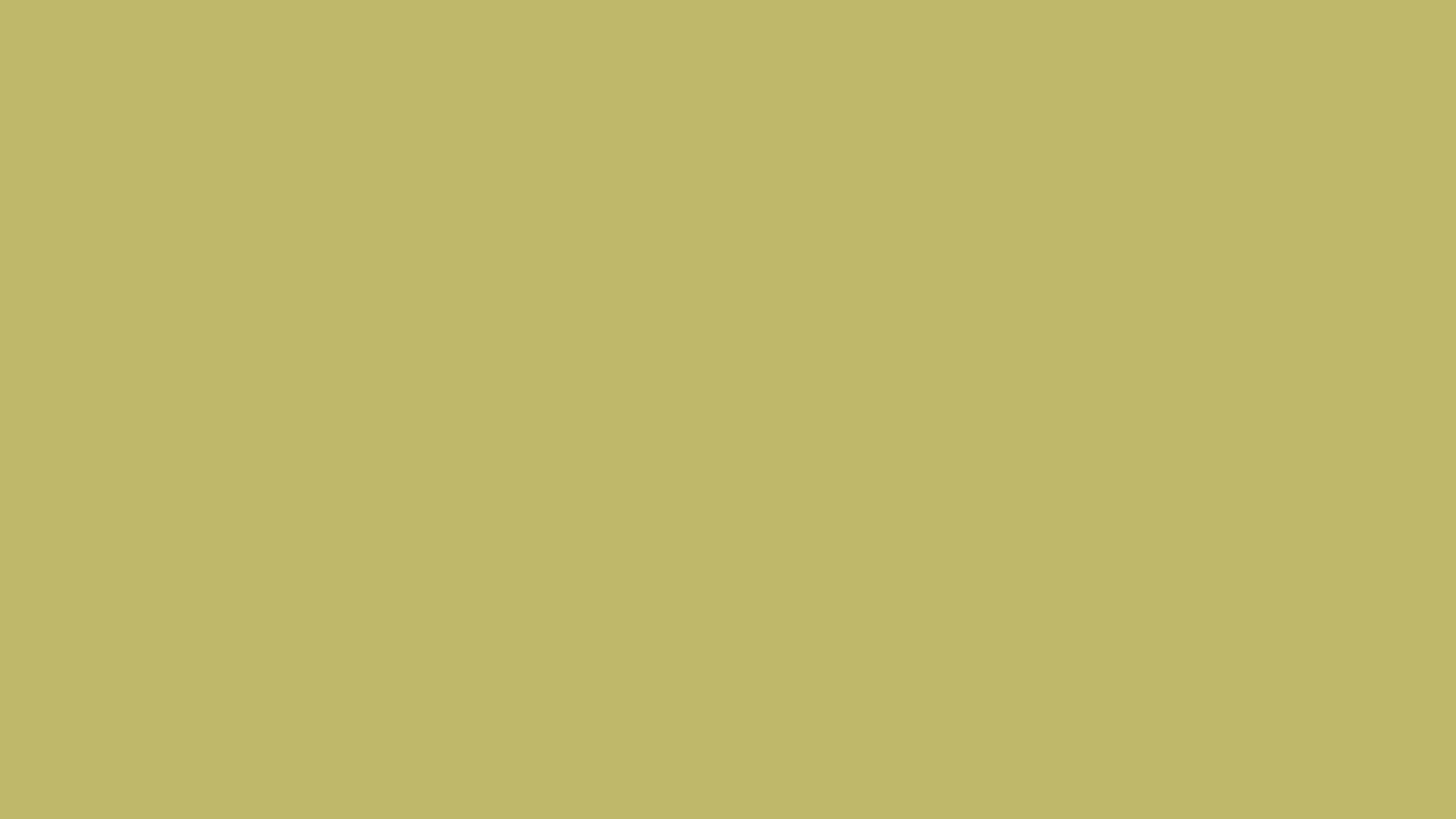 Standard Wallpaper: 1920x1080 PNG (#BDB76B)
Download Options
All wallpaper files precisely match the W3C standard color value:
CSS Standard & Usage Notes
darkkhaki = #bdb76b (rgb(189, 183, 107))
UI Design & Accessibility Guidelines
Use it for earthy, military, safari and outdoor palettes, and for calm backgrounds. On Dark Khaki, black text passes WCAG AAA at every size (10.15:1); white text fails even for large text (2.07:1).
Frequently Asked Questions (FAQ)
Can I use black text on Dark Khaki?
Yes. Black text on Dark Khaki has a WCAG 2.2 contrast ratio of 10.15:1, passing both AA (4.5:1) and AAA (7:1) at every text size.
Can I use white text on Dark Khaki?
No. White text on Dark Khaki has a WCAG 2.2 contrast ratio of only 2.07:1, below the 3:1 minimum even for large text.
What colors go with Dark Khaki?
Black, Navy, Dark Slate Gray, Dark Olive Green, Saddle Brown and Ivory all go well with Dark Khaki. Black (10.15:1) and Navy (7.74:1) have enough contrast for text on Dark Khaki; Dark Slate Gray, Dark Olive Green, Saddle Brown and Ivory work better as a background or accent.
What is the difference between khaki and dark khaki?
Dark Khaki (#BDB76B) is darker and much less saturated than Khaki (#F0E68C): 38% saturation against 77%. It has a slightly olive cast.